About Me

My photo
The name is Sarah E. Walsh, I use my work of art as a way to express God's blessings to this world. And God has been my biggest inspiration. Life has brought many things, and throughout all that I have been through I have realized one thing; art has always been my passion and God has never failed to amaze and guide me. I hope that when others see my art their minds are open to see the beauty of this world. One of my favorite things in life it to experience a calm inspiring setting, where I can feel peace, serenity, joy, and happiness. Whether I am driving in my car, with the wind in my hair, or walking along a calm lake where you can hear the stillness of life, I use my camera to capture those pictorial settings. These experiences often spark an inspiration to create art. My interest with different mediums and art styles is constantly expanding. If we slow down, stop, and thoroughly examine all the natural beauty that is around us, we can experience a little more spice to life, hence my blog titled 'Salt to the Earth'.

Friday, December 17, 2010

Mineral Water Logos

Final Project for Graphic Design Class. December 17th, 2010

Here are four images that I created using a fine tip pen and watercolor paint. I wanted to create multiple pieces, but have them grouped as a whole. I  wanted to do product labels, and I wanted to incorporate sea creatures; the final idea? Flavored Mineral water labels :)


Final words: I think I may redo Mr. Lemon-Lime fish and possibly Little Mrs. Seahorse.

The End.


By: Sarah E. Walsh

Friday, December 3, 2010

Casual Swirl Font

Designed Nov. 2010 By: Sarah E. Walsh
Casual Swirl Font

Chambers Visit

Last Friday (November 19th, 2010) our Graphic Design I class met at Chambers in Minneapolis on a little field trip/tour.  It was a nice visit. Chambers has art exhibited throughout the hotel building. Some of my favorite were by LOOK UP NAME. She had two pictures hanging up… they appeared to be about  5’x7’ or something close to that. She used OIL OR ACRYLIC, and her paintings looked very realistic. The eyes, details, and shadowing were amazing. Since I am an eye person, the eyes is what really drew me into her paintings. They were amazing!

I walked into a room that Brittany Spears staid in, I thought that was pretty cool. The room was lined with windows and sheik curtains. With experiences, I have realized that windows and the open outside environment gives builds a stronger sense of creativity rather than closed in spaces. Now I know why artists prefer studio apartments and areas with large windows. This is why I believe Chambers has many windows throughout the building and many, many windows in their hotel rooms. Chambers is an art museum, so its all about creating an environment pleasing to the senses. The halls have a calming scent, the lights in the halls give off striped light unto the ceiling due to light coverings, and the bathrooms are just brilliant. The toilets are squarish and the flushers are square buttons. The walls remind me of old school Mario with the red shiny brick walls. The sinks are an odd shape also, but very appealing. Overall, Chambers gave me a curious calm feeling. It was very bright, artsy but very very modern. It was appealing but not as appealing as it could have been. That is due to the fact that I am drawn more to darker, vintage, nature themes, and both original and traditional types of art or environments rather than brighter, simple, and modern… which is what Chambers is. My favorite Art Work were two large oil paintings done by Machiko Edmondson titled Titanium Expose and Flame. These artwork pieces were large scale faces. They were done very well and very detailed. They looked almost real. The artists time and effort showed through their work. Besides this art work, there wasn't really too much art work that captured my attention.

Friday, November 12, 2010

Artist: Kristina Mooney

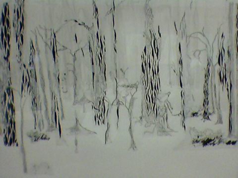
A piece titled, ‘Untitled’ hung in a small hallway of Anoka-Ramsey Community College in Coon Rapids Minnesota. 
                         Top Image-"Untitled", Bottom Image-Focusing on a part of the piece.

There were other pieces besides that piece…artwork from roughly eight other artists I would say. This piece by Kristina Mooney captured my attention the most.

The piece was done using Ink, Paper, and vellum on paper. I think it captured my attention the most because I, myself am drawn to using ink and paper. There is something simple about it yet intriguing. But it wasn’t just the type of medium used that captured my attention- the more I looked at Kristina Monney’s piece the more I discovered about the piece; hidden creatures and detailed lines that one wouldn’t notice if they quickly scanned their eyes over the piece.  
I looked at some of Kristina Mooney’s other work. She seems to draw a lot of architect and buildings. She lives in Minneapolis, so I feel like she is creating works of images that have made an imprint in her mind of the everyday things that she sees in the city. Her one piece that I am reflecting on is different in the aspect that it doesn’t reflect on the city. It is a piece that shows many trees, a forest. I am not the artist, so this is a wild guess. But I feel like she wanted a change apart from the city. Since the piece doesn’t have a title… it may not have that deep of a meaning. I feel like she just wanted to create an image that was happy and pure in nature and away from manmade things. The image gives an enchanted feeling… and like I mentioned earlier, if you look closely, you discover little creatures. I think they are having fun and basking in this time of running through the woods. The usage of the line patterns of the tree bark is very nice. And she uses a nice contrast of dark and light lines. So in a nutshell, the words or phrases that I would use to describe her “Untitled” piece of art would be:
Enchanted, Forest, Remote from human development

But besides Kristina Mooney's "Untitled", since her work shows a lot of city images, I would describe her work as far from remote of human developement . Infact, I would describe most of her work as:
City life, Architect, Busy
           *I could see Kristina Mooney’s work on a newspaper…. It has similar texture and colors. Therefore, to promote her work I would come up with post-card sized business cards with some of her work on them and somehow incorporate newspaper with the heading of the newspaper listing ‘Kristina Mooney’, with the heading stating a sentence that significantly describes her and then just a small paragraph about her work. What better way to capture the attention of somebody than showing images.  I think it is very important for artists to have their work on flyers, business cards, and etcetera. It would take long, but I would do this by using an old school typewriter and type up the postcard sized ‘Name and info’ on old looking paper to get the newspaper look. Then I would put that unto a thick piece of postcard-like paper and then have small images of some of her work that I would also put in front of the newspaper. Finishing it off I would use ink to write Kristina Mooney’s contact information at the bottom. I think that besides the postcards…. Flyers could also be done this way… as well as scanning the finished information/contact card or flyer and digitally posting it on your facebook page, blog, or whatever social network it is that you use online.

Friday, October 29, 2010

Foshay Funanza

   Foshay Funanza 
Digital Print
Oct 27th, 2010. Photo Taken by: unknown, stolen from: google images. Photo Edited by Sarah E. Walsh.

-Here is an edited version of the Foshay Tower which stands in Minneapolis, Mn. I used an image that I had found online... really wasn't up for the idea of stealing somebody elses photograph, but I was unable to make it to the Foshay Tower myself to capture an image. With this image I flipped it vertically... live traced to make the colored photograph pure black and white cartoonie, and added a background that I did take myself of a leaf. I edited the leaf- messed around with the levels, saturation, curves, color balance, and brightness/contrast. I also changed the segment of the picture that lies directly behind the Foshay building to a lighter brightness just to add a little more of an appeal. I then added font- bent it and added a background to it, that once again, was an image that I had taken.


Weathering Away Foshay 
Mixed Media
By: Sarah E. Walsh Oct. 23rd 2010

This image was done using sketchbook paper, a pencil, watercolor, acrylic, cotton balls, and a little bit of rubbing alcohol (for spot affects). 
This idea was just there... I really love silhouettes and bold colors, so I used that idea. Even though the Foshay Tower is weathering away... as with everything of this Earth, it is still adored by many, and has been restored and kept alive.


Artists Visual Stimuli of the Foshay
Mixed Media
By: Sarah E. Walsh, Oct. 24th 2010

 My favorite medium to use is a simple pen followed by coloring with watercolor. This is what I used in this picture. I wanted to come up with a really creative artsy concept of the Foshay Tower, and that is what I used for this image. Since the Foshay Tower was build in 1929, just a few months before the stock market crashed, and the Great Depression shortly followed the construction of Minneapolis's largest skyscraper at the time, I added a quote from Calvin Coolidge about the great depression. I also added a little money jar. I wanted to incorporate some sort of history in this image. 


Note *A lot of my ideas develop as I hold my pen to the paper and start with a circle. The rest follows randomly by images in my head that outline what I have drawn. Abstract is intriguing in my eyes, and that is what naturally comes to me a lot of the times when I am drawing.

Thursday, October 14, 2010

Metaphors

A small reflection on the first two chapters of METAPHORS We Live By, by GEORGE LAKOFF and MARK JOHNSON.     
  Honestly, I found myself a bit lost when reading Metaphors. I understood the main point that metaphors are a part of everyday language, but the way in which the book is written seems geared towards extreme cognitive thinking very knowledgeable people. For example, using words such as mundane, pervasive, contrary… it’s very tough vocabulary for me to understand unless I have a dictionary right next to me to look up the words that I do not fully understand. I do have to admit though, prior to reading the first two chapters of Metaphors, I was not aware that metaphors were used as much as they are in everyday language. Also, when I think of the word metaphor, I think poetic imagination- as the author Mark Johnson states. But metaphors are also literal. For example, like the book states, Argument is War and Time is Money. These are not poetic, but rather literal and are heard as common terms in our everyday life.  

Site Example of Metaphors:

How Can Metaphors be Helpful with Design?
 I remember hearing somebody in class talking about their confusion on how metaphors can help you in graphic design. They pondered on that questioned… and I am not sure on whether they ended up finding a connection between the two or not. Here is a good website, http://www.bellaonline.com/articles/art1674.asp  that discusses how metaphors are a huge help with web design (think design in general!).


Thursday, October 7, 2010

A well written artists statement.

Sadly, before being asked to find an artists statement that was written well, I always thought that an artists statement was just a quote made by an artists. After trying to find one, I found out that this 'thought' was wrong and that an artists statement was in fact a little more than just a quote! It is the background to an artist and his/her work. It explains why an artist does what he/she does. How they got into their work, how it is good, what they like about it, what does it communicate, what medium is used, what their influences are, how their work come about and so forth.
I found it very hard to find artist statements! Maybe I was looking the wrong way… In the end I ended up finding a couple, and one that I found to be well-written was Martin Langford's...

I don't set out to produce art about one subject or another. I'm never without a sketchbook to hand so I am constantly drawing and sometimes the drawings are left in the sketchbook and other times they develop into more in-depth ideas and detailed images.
I didn't set out to be an environmental artist or to create artwork relating to social commentary but as my portfolio developed and people started to review my work, the descriptions started to emerge and I began to notice a pattern I hadn't intended but am now please with.
My work tends to focus on the environment, the evolution of man and his material wealth, the development of bigger and bigger cities, more and more people, cars and industry on the planet and the consequences this has on nature. Some reviews have labeled my work as 'black humour' but I always try to depict a positive message too - the persistence of nature in recapturing what once belonged to the earth.
At school, the only class I really paid any attention in was art. I simply wasn't interested in anything else and I think my obsession with depicting the monotony of the work place and work force started there...
Some of my subject matter is about people's daily routines and a comment on human nature. And since I've always been a fan of mafia films - a new strand of work seems to have emerged depicting a very 'human' and 'school playground' side to mob life.
None of it was intentional - it all developed and evolved over time. People always ask for my artist statement so I needed to do one but I've never liked to explain a certain piece of work - if you've made a picture and that's how you wanted it to be - hopefully it can speak for itself and whatever it says to the viewer - it's the right message because there isn't a wrong and a right message. Each person takes something a little different from the same picture and I'm happy with that.
Influences
My influences are first and foremost everything I see, feel and experience, but I've always loved comic books particularly work by Harvey Pekar and Robert Crumb. I love architecture particularly Art Deco. The artists I most admire are John Martin, a mezzotint artist from the 1800's, Winsor McCay a cartoonist and animator who created Little Nemo, Escher and Lyonel Feininger creator of Kinder Kids. I grew up watching films such as Metropolis, Flash Gordon, Star Wars and Brazil.


                    -Martin Langford

He explains how he gets his ideas for his work, how it came about and why he does what he does, what his work does well, what he communicates through his work, how important it is to him, and his influences.